
What is responsive website?
Responsive websites are websites which change their layouts according to user’s device size. Strictly speaking, they are responsive for the width of the devices, not the actual size or the type of the devices.
How do we make it?
We can basically make it with a html file, and one or several CSS files.
Today, we’re going to make it with 2 CSS files. The first one will be the usual one you always make, which is for desktops. And the second one will be for tablets and smartphones.
And those 2 files target the following sizes:
- width over 961 px (for desktops)
- width less than 960px (for tablets), and less than 641 px (for smartphones)
The sizes are not fixed, so it can be changed. But as you can see, it’s very simple. Yes, it’s not that hard to work on. But there are still some things you are not really sure, I guess. So let’s make sure those together in the next section.
What do we need to do?
- Set view ports in your html file
- Set Media Query in your CSS
Okay, let’s go through from the first one. If you don’t know the word “viewport”, you can just think that it is a virtual window which shows the contents of your website. Imagine if the virtual window is 980px, but the users use their own windows of which size are 360px. Yes, like smartphones. They won’t be able to see all of the contents properly. For example, it just shows a part of the display, or it shows all like you see with your desktop, but too small to read. So to avoid these kind of things, you set the viewport like this below.
<meta name="viewport" content="width=device-width, initial-scale=1.0">
Yes, this is a meta Tag, so it’s going to be in the head Tag in your html file. If you want to know more about viewport, maybe it’s good to have a look at w3schools.
Secondly, let's deal with Media Query. It checks the screen type and the characteristics of the device, and allows the developers to change the CSS style according to those characteristics. And as you might guess, it goes into CSS files.
For instance, you can set a Media Query like this below.
                    @media screen and (max-width: 960px){
                        body{
                            background-color: blue;
                        }
                    }
In this case, if the width is less than 961px, the background colour of the website will be blue. If you’re not familiar with the word, max-width, that means maximum width. The opposite one is min-width which stands for minimum width. You can also find further information of Media Query in w3schools. Okay, it’s time to work. Let's create a responsive website together from the next section!
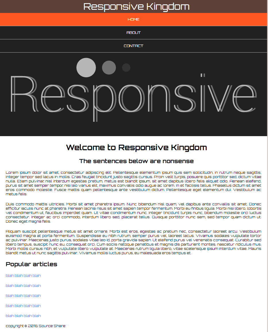
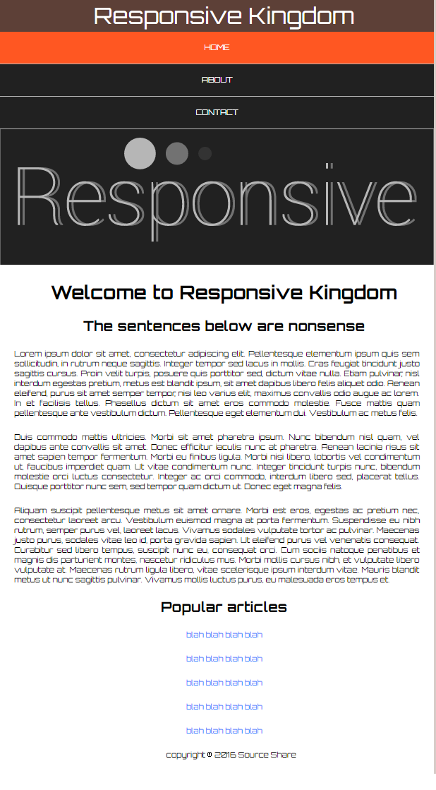
Sample images
The images below are the ones we're going to create. You can have a look at the actual website here, and change the size of the browser. You can download the sample html files and images from the download button below as well.
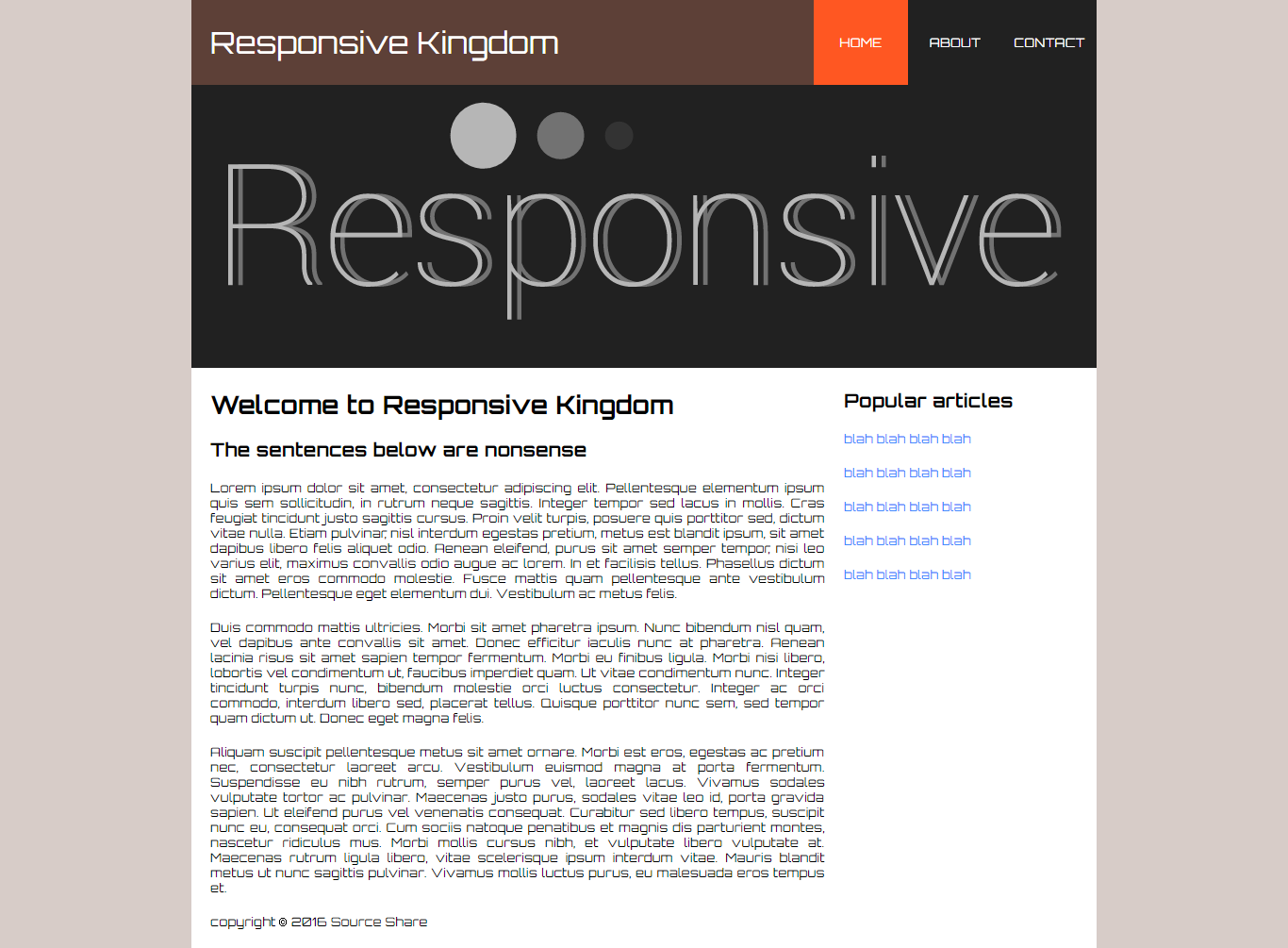
HTML file
So first of all, let's have a look at the html file.
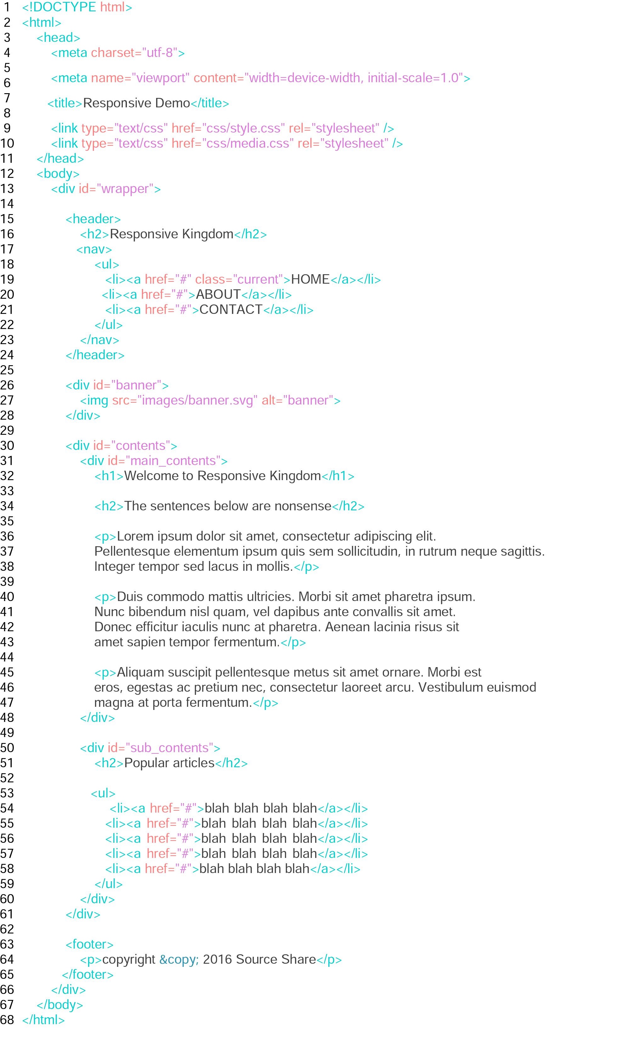
It has the viewport in head Tag, and linked to 2 CSS files. Other than that, it's pretty simple. It has a nav in the header, then a banner comes next. After that, the main contents which is divided into 2 columns for the moment follows. You can get the contents of the p Tags from Lorem Ipsum.
CSS file for desktops
Next, we're going to work on the usual CSS styling. The top part is a link to a Google fonts. You can change the font into whatever you like. The next messy part is reset CSS. It resets the default setting of CSS, and make it plain. You can copy the codes from the website.
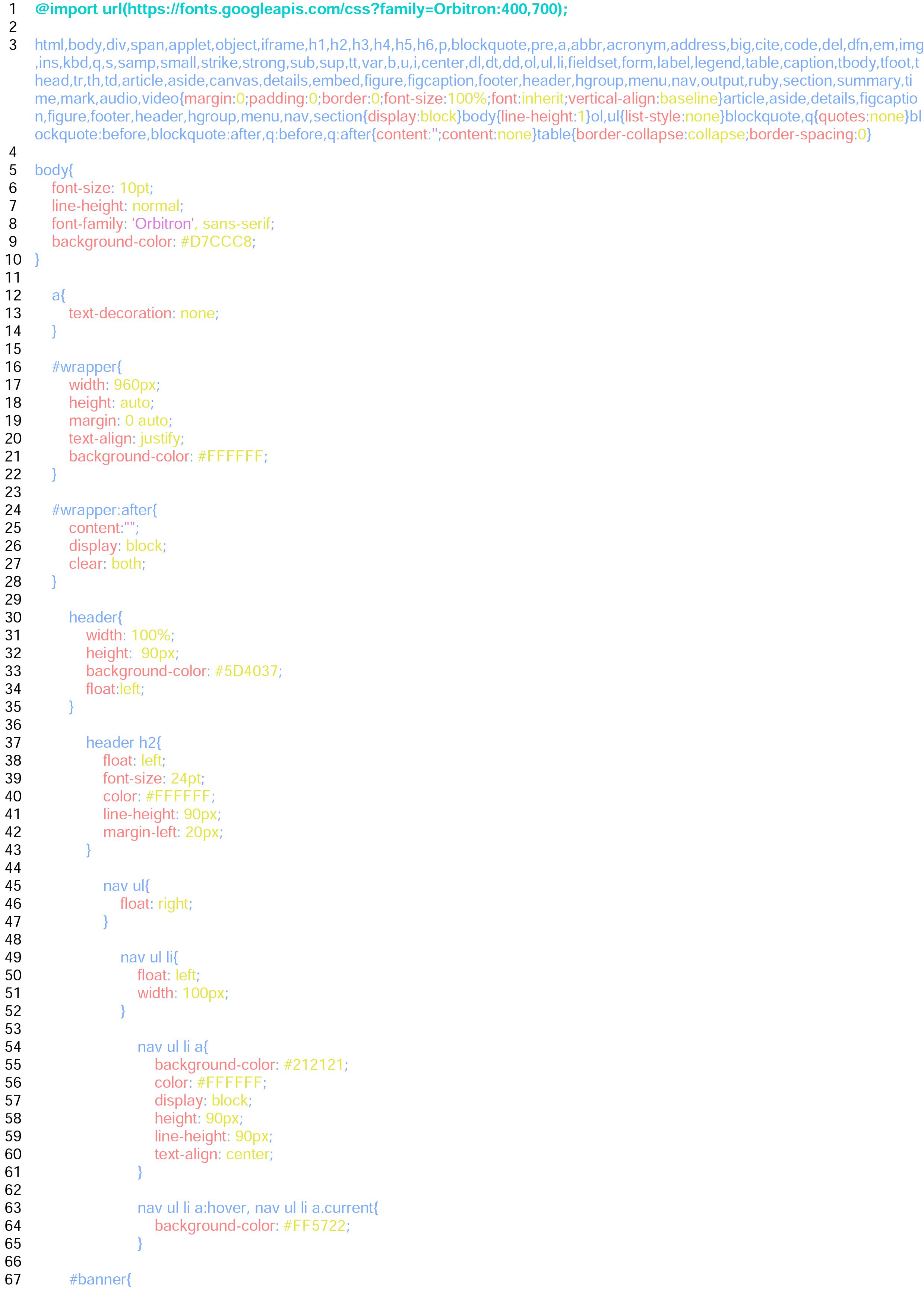
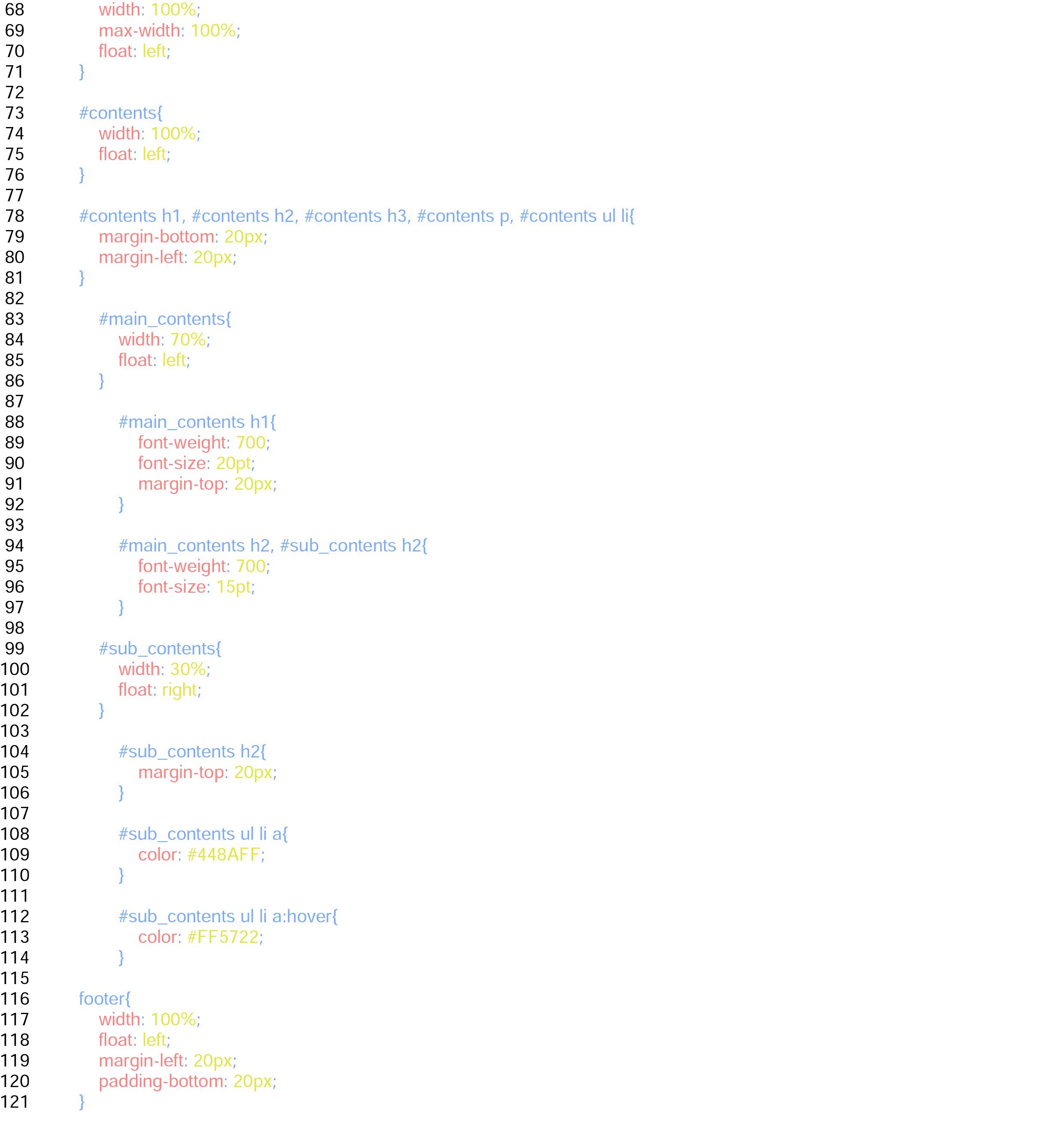
After that, as it's become totally plain, we set the basic font size, and line-height in the body Tag. Don't forget to put the font-family here if you get a font from Google fonts.
We set the width of the id wrapper 960px for this one, then set the margin 0 auto to make it horizontally centred. The wrapper: after part is to clear the float we're going to make, so don't forget to set it.
Setting the width of the banner 100% is important to make it flexible, and to avoid to make it surprisingly huge with very wide screens, it's better to put max-width 100%, so it wouldn’t get too big and ugly.
I'm not going to explain float or others in this article as it's different topic; however, if you're not really sure how to float, check these great sites below. It will surely be very helpful for you.
CSS file for tablets and smartphones
Finally, this is the highlight of today's topic, another CSS file for smaller devices. What we do here is basically setting the Media Querys, and putting some changes on each size. We're not going to write a whole CSS again, so don't you worry.
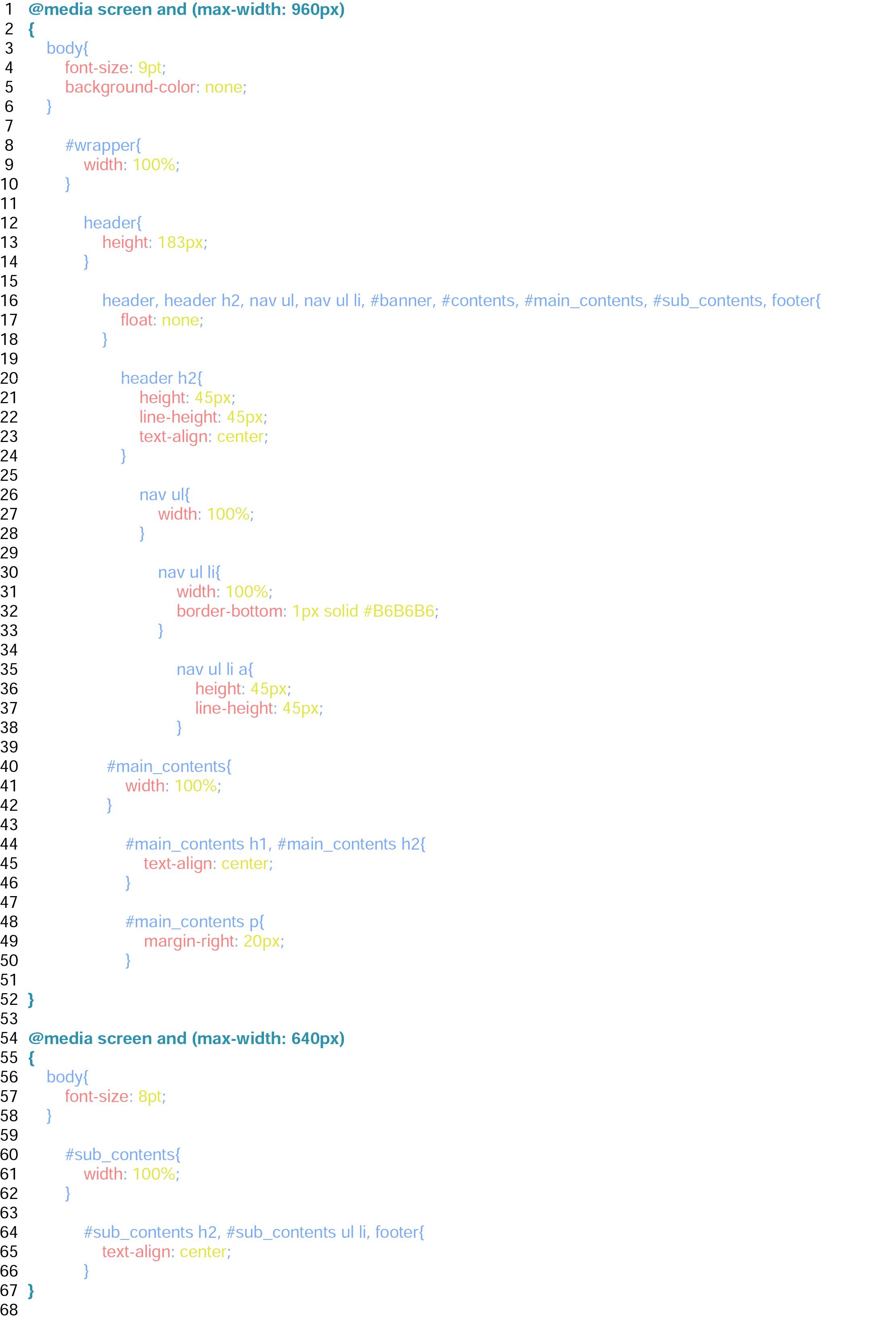
The first step is obviously setting the first Media Query. This time, we set max-width 960px, which means this styling will just only show up when the display is less than 961px.
After setting the very first Media Query, let's change the basic font size slightly smaller, and set the background-color none. The body part in any case disappears when it gets smaller than 960px as we set 960px for the width of the id wrapper. So we don't need it anymore.
Then change the wrapper's width into 100%, so it will be full screen. We also make all of the float none to make it slim down to 1 column here.
The original height of the navs and h2 of the header might be too big, so let's make them a half. And as we do so, and put border bottoms for the navs, we change the height of the header into 183px. The extra 3px is from the border if you wonder.
After that, change the width of navs into 100%, so it also goes by the edge of the display. Making those navs and h2 centred looks nicer perhaps.
We also modify the width of the main contents 100%, so it wouldn't end in the middle of the display. Let’s make those centred as well.
And now, as we disabled all of the floats, the sub-contents should be below the main-contents followed by footer. We're done for the tablets one by now. Great job!
Lastly, let's work on the smartphone one.
Just set the Media Query like we did for the tablets one, but this time, the condition will be max-width 640px. So it works only when the display gets smaller than 641 px.
We actually don't really have lots of things to do here as we have already changed all of the layout into 1 column, but maybe it's better to change the font-size a bit smaller again. Then adjust the width of the sub-contents into 100%. It doesn't really have lots of contents, but with this small size, it should be fine to make it 100%, and we can now finish with changing the text-align of it into centred.
Congratulations! We're done.
It's probably not THE standard way, but this is one of the ways of how to make a responsive website. You can look for some other resources, and find something you're comfortable with as well. It's always good to get some alternatives. Good luck!